
Now that you know what types of stocks to look for (“Stocks in Play”) and how to find them (scanners), in this chapter, we analyze the behavior of these stocks using candlestick charts and define candlestick patterns that day traders look for to help them find the best time to enter a trade.
The playbook is where the trader seeks the small edge. Binomial process trading keeps the outcomes measurable so setup quality can be diagnosed instead of buried under inconsistent sizing and exits.
As you already know, traders want to buy low and sell high for a long position, and short high and cover low for a short position. The candlestick patterns described in this chapter are designed to help traders achieve this. For example, when taking a long position, there are tricks you can follow to help you enter the trade when the price is in a transient down-trend within the overall upward trend so that you get a good (low) price for your long position entry.
There are countless candlestick patterns named by day traders. This book is not intended to be a complete reference on candlestick patterns, so we will only cover a few of the most common ones and describe how day traders profit from them. You only need one or two candlestick patterns in your repertoire to be a profitable trader. Plus, if you are able to find enough trades with a single pattern to earn your desired income, then there is no need to learn additional patterns.
I believe opening range breakouts (ORBs), ABCD patterns, and reversals are the best way for beginners to learn to trade. They are simple patterns that make them easy to learn, but, most importantly, they are rooted in sound supply-and-demand theory. Personally, I’ve never traded anything other than these patterns.
These three patterns are also attractive to traders because they can be effectively traded within the first 30-45 minutes after the market open, making for a very short workday. However, ORBs are very fast-paced and require split-second decisions, which may not be to everyone’s taste. Some traders prefer a more relaxed trading style, focusing on reversals or other strategies that can be traded over longer time scales.
There is no “one way” to day trade. Every trader has a unique approach. Some will keep reversal positions open for hours, while others will be in and out in a few minutes. They could have the exact same R/R ratio, win rate, and profitability, but trade the reversal completely differently. This is because there are no silver bullets or magic candlestick patterns that universally generate profits for all traders.
You should choose the strategies that you feel are easiest to trade and that make you the most money. That is to say, whatever gives you the best combination of R/R ratio, win rate, and trade frequency to give you the most income.
Looking into the Past, Present, and Future of a Stock’s Price
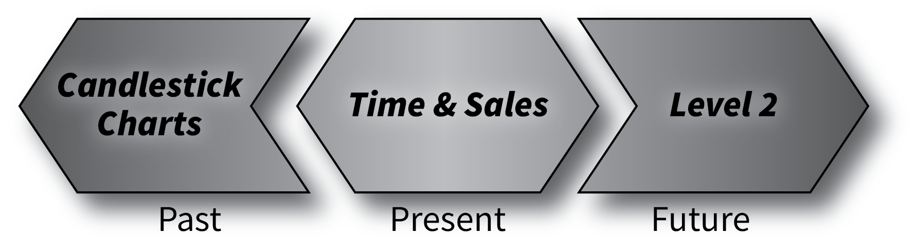
Figure 6.1 – Candlestick charts, Time & Sales, and Level 2 describe the past, present, and future of a stock’s price action.
Candlestick charts, along with Time & Sales and the Level 2 order book (Figure 6.1), give you all the information you need to see into the past, present, and future of a stock’s price.
Candlestick charts look into the past of a stock’s price period by period. Time & Sales tells you what is happening in the moment with its running log of all orders flowing through the market for that symbol. Finally, the Level 2 order book can act as a leading indicator, peering into a stock’s future price by showing all open orders for the symbol. Together, they are the trifecta of stock price information. These three pieces of information will help you find the perfect time to enter a trade.
Candlestick Charts
Candlestick charts are just one of many ways to represent a stock’s price. Other chart types include range bar, equivolume, line, and Heikin-Ashi, among others.
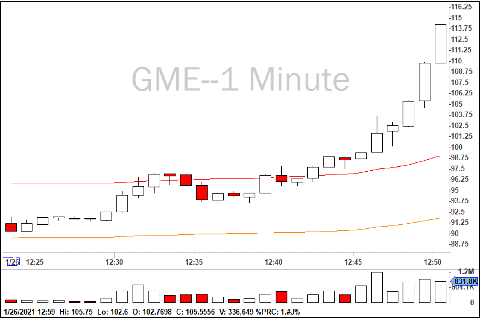
Figure 6.2 – 1-minute candlestick chart for GameStop on January 26, 2021.
Candlestick charts, like the ones in Figure 6.2 and Figure 6.3, are also known as OHLC charts, as each bar identifies the open, high, low, and close prices for each period. This is the most common chart style used by day traders.

Figure 6.3 – Anatomy of OHLC candlestick.
How do we know which end of the body is the open and which is the close? Traders can define any colors they want for their charts, but typically, a white candle indicates the price increased during the period, and a red candle indicates the price decreased. Therefore, when looking at a white candle, we know the open is at the bottom of the body, and the close is at the top, with the high and low of the period being at the ends of the tails/wicks.
The white candlesticks are therefore bullish candles, and the red candles are bearish candles. When looking at a candlestick chart, you can see who is in charge during different periods of the chart. In the case of GME above, you have a very strong bullish trend across the chart. This example is one of the wildest charts of 2021, where you see a stock’s price increase 35% in less than half an hour. The bulls are obviously very much in control of GME during this period, so there are many white candles, most of which have little or no wick on the bottom. The small or missing lower wick means most candles are upticking after they open with little or no pulling back during the candle’s period.
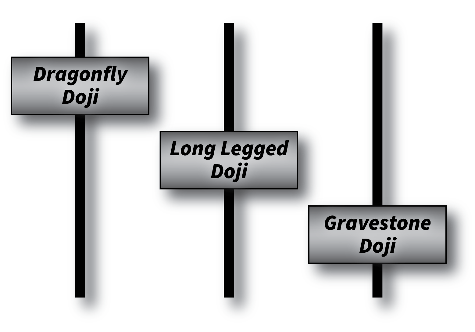
Figure 6.4 – Candlestick Doji.
The relative proportion of a candle’s wicks and body also has a story to tell. Take a look at the candlesticks in Figure 6.4. In each case, the open and close prices are approximately the same. In the case of the dragonfly doji, the bears tried to push the stock price down but ran out of steam, and the candle closed back up near the top. This could signal the end of a downtrend and the start of an uptrend. The opposite is true of the gravestone doji – bulls tried to push the price up but couldn’t, so they may be exhausted at this point, and a downtrend may follow. Traders often look for doji when considering taking reversals.
The middle doji is called an “indecision” candle because it indicates there is no clear leader in the market. During that period, the pressure from both bulls and bears was equal.
When looking at candlestick charts, you aren’t just looking for specific patterns – you’re also looking at the candles’ characteristics to see who is in control. You might spot a good setup for the ABCD pattern, but if it’s not clear from the candles who is in control when you are ready to enter, then you should not enter the trade.
Indicators
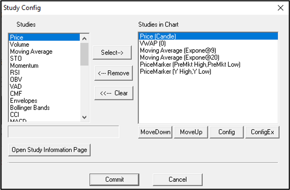
Figure 6.5 – DAS Trader Study Config.
Day traders love to add indicators (Figures 6.5 and 6.6) to their charts. Example indicators include simple moving averages (SMA), exponential moving averages (EMA), and volume weighted average price (VWAP). There are probably more than 1,000 indicators used by day traders. These are running calculations based on the stock’s previous price and/or volume.
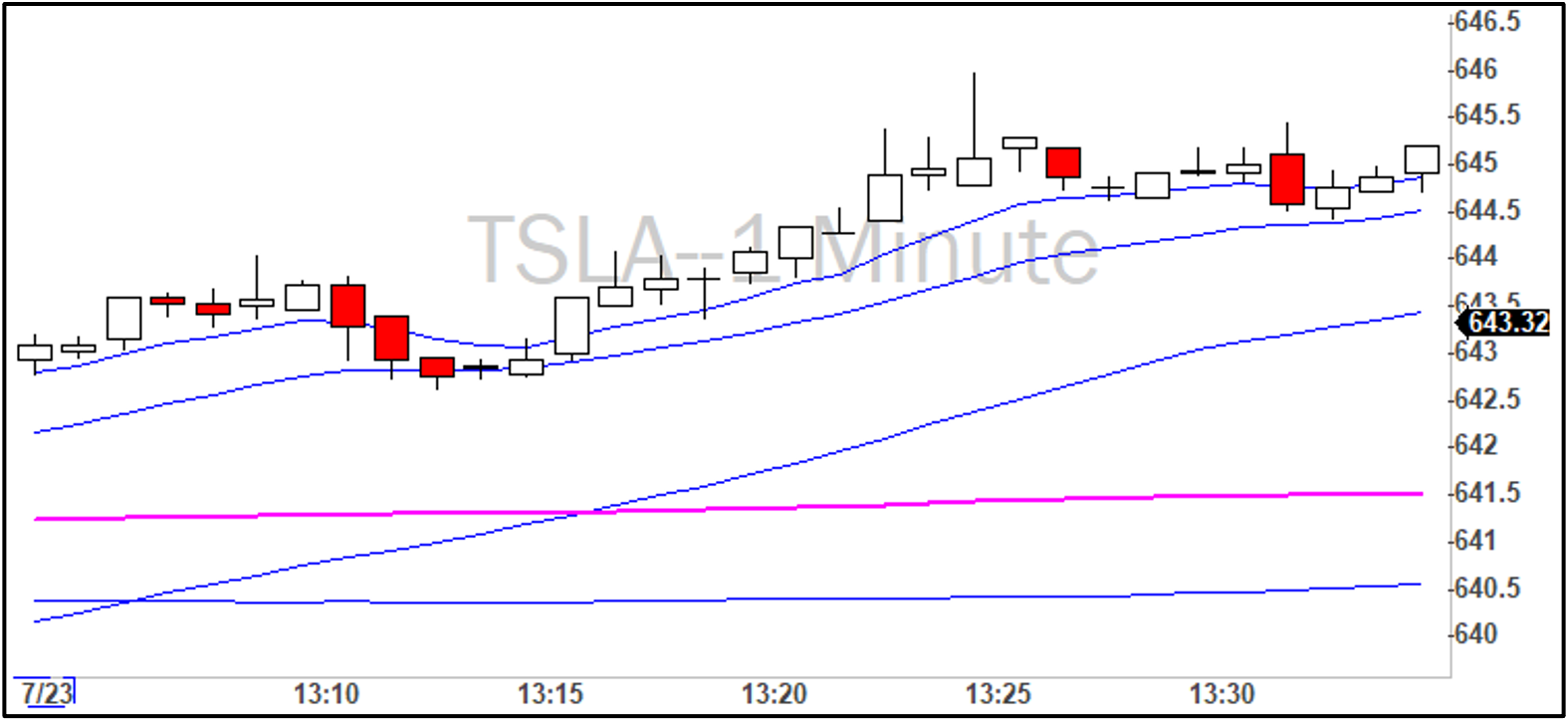
Figure 6.6 – EMA, SMA, and VWAP Indicators.
In general, the idea is to gather additional information that is not immediately apparent from looking at the candlesticks. For example, by comparing the candles to indicators like SMAs or VWAP, you can tell when a stock’s price is getting ‘extended’ from where it normally trades. A stock that is very extended may be primed for a reversion to the mean, creating a trade opportunity.
However, in my never-ending battle to keep trading as simple as possible, I have removed all indicators from my charts except VWAP, which I use to help time entries as discussed later in the chapter.
Figure 6.6 shows the relative positions of the 9-EMA, 20-EMA, 50-SMA, and 200-SMA indicators for TSLA on 7/23/21. Because TSLA was in a strong uptrend, as indicated by its current price being above all moving averages on the chart, someone looking to take a reversal might look for a gravestone doji in addition to candles moving below the 50-SMA. Each on its own could indicate a reversal is coming, but together they make a stronger case.
The indicators and candlestick patterns you use are part of your playbook. It also includes all the other details about the candles, indicators, and other information at your disposal that give you sufficient justification to take the trade. I would recommend starting off with zero indicators for at least the first two blocks in the simulator. Then, only add indicators you feel are truly helpful. Less is best. Adding indicators just for the sake of having indicators is distracting and clouds your judgment. You start to see things that aren’t really there.
There are countless resources on candlestick chart indicators. Some people even pay money to access them. Remember, as an RST trader, your baseline for random trading (no charts or indicators) is breakeven (minus commissions, fees, and the bid-ask spread). Your job is to move the win rate just a few points above breakeven so that you cover these fees and start making money. This is achievable through basic market awareness and proper stop-loss placement. You don’t need any indicators to do this. Always keep these fundamentals in mind before making any changes to the system, such as adding a new indicator, and ask yourself whether it will really move the needle on your win rate. Finally, make sure you have a solid grasp of your existing win rate over at least 3 blocks of trades (more than 300 trades) before adding an indicator. This way, you have before/after data to see how the indicator impacted your trading.
Time & Sales
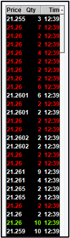
Figure 6.7 – DAS Trader Time & Sales.
Time & Sales (Figure 6.7) is a running log of all filled orders for a particular symbol as they move through the market. This window shows what’s happening at any given moment. Every transaction for the symbol flies through this window in real time. For high-volume stocks, the Time & Sales log might move too fast to be useful unless configured properly. Right-clicking the window lets you filter out orders with smaller share quantities. I have mine set to display only orders with a share quantity greater than 100 shares, which usually slows the Time & Sales log enough to be useful. I also have the “Share / 100″ box checked, which means all values in my Time & Sales windows are shown in lots of 100. Therefore, when I see a “3″ under the Qty column, that means 300 shares. I will also see a Qty of “1″ for orders down to 100 shares.
If you’re trading highly volatile stocks at the open and making split-second decisions on when to enter a trade, Time & Sales can help determine when to enter. The default color settings in DAS Trader show orders in green when they hit the ask and in red when they hit the bid. Seeing a run of red followed by a run of green may be a good time to enter a long position for an opening-range breakout (ORB) trade strategy, for example. In an ORB trade, once you have identified the trend (up or down), look for a pullback to get a good price, then enter the trade right before it takes off. The pullback and turnaround would appear as a run of red followed by a run of green in Time & Sales.
Level 2 Order Book
Candlestick charts are the most essential part of trading, with the Level 2 order book being a close second.
The Level 2 order book contains all open limit orders from the exchanges your trading platform is connected to. Of all the information at our disposal, the Level 2 is the only one that can act as a leading indicator. All the moving averages and other studies cluttering our candlestick charts are lagging indicators that describe what has already happened. The order book can sometimes tell us what is going to happen.
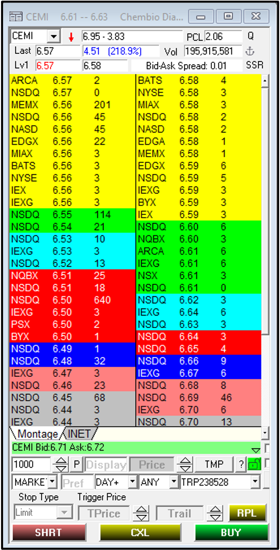
Figure 6.8 – DAS Trader Level 2 order book showing imbalance between bids and asks.
Figure 6.8 shows a few large bids on the left side of the montage window in DAS Trader. These are orders to buy up to 20,000 shares. It’s counterintuitive, but this may signal that the price will go down in the short term. In grade school, we were taught that increasing demand raises prices and decreasing demand lowers them. So when we see large orders to buy shares, shouldn’t that mean increasing demand and higher prices?
Not so fast. What we are actually witnessing on Level 2 in this case is large limit orders from informed traders, and likely those with sophisticated computer models or servers co-located on Wall Street. Based on their information and models, they believe the price will continue to decline, and they will be able to buy your shares at a price lower than the current best price.
Therefore, large asks on the Level 2 can be a bullish sign, and large bids can be a bearish sign for near-term price direction. When trading the market open, the window of this indicator is open for no more than 10-20 seconds. Generally speaking, you will have identified a favorable candlestick pattern, then look at Time & Sales and Level 2 to confirm a good time to enter. When you see the large bids/asks, you would enter the trade.
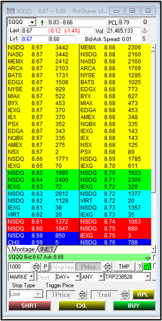
Figure 6.9 – DAS Trader Level 2 wall of orders.
Another interesting Level 2 phenomenon is shown in Figure 6.9, where “walls” of orders build up on both sides of the Level 2. With an equal and large number of buyers and sellers in the market, it’s very difficult for the price to move. You’ll often see these walls build up around even numbers like $25.00, $50.00, and so on, especially if those numbers have additional importance, such as a recent high or low.
Some traders use these order walls to build strategies. If a stock has been trending upward all day upward but then hits an order wall at $25.00, it can be a good time to enter a long position if other data, such as company news, is also bullish. By entering the trade at the order wall, there is very little downside and a large upside. Especially if it’s a high-of-the-day or an all-time high. If there is enough market demand to eat through the wall of sellers, the stock could accelerate upward quickly once the sellers are cleared. This is also what often happens in the ABCD pattern. The consolidation phase of the ABCD pattern often occurs when there is a balance between buyers and sellers, so the price levels off for a bit. Once all the sellers’ orders have been filled, the price can continue to move.
Mass Psychology & Support and Resistance Levels
One last item to add is support/resistance levels. These are prices at which a stock may reverse course or fizzle out. For example, if a stock’s price has been trending upward toward the previous all-time high, many traders may treat that price as a resistance level, meaning the stock will not go higher and will either fizzle out near that price or reverse course entirely. It’s called a “resistance” level when the level halts an upward trend, and it’s called a “support” level when it halts a downward trend. These levels do not necessarily force a complete reversal and may only cause the stock to oscillate around that level and fizzle out.
In the case of a reversal at the previous all-time high, the mass psychology is: “No one has previously valued the stock higher than this price before, so why should we now?” If there is no demand to break through the level, many traders will sell their shares, which lowers the price further and reinforces the resistance level as a self-fulfilling prophecy.
You may also have stockholders who previously purchased at that all-time high, hoping it would keep rising, but are still “holding the bag” and eager to sell for breakeven at that price, which further pushes the price back down from the resistance level.
These ways of thinking create a herd mentality among traders. Everyone is paying close attention to these “important” levels, such as the all-time high, the previous day’s open, the previous day’s close, the pre-market high, and the pre-market low. Some traders even look back two days for additional OHLC values. However, if your chart looks like Figure 6.10, is it really useful?
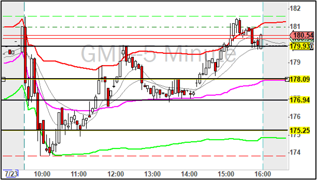
Figure 6.10 – Indicator and level overkill.
For me, not every peak and valley on a chart has significance, so there’s no need to draw a horizontal line for every one. That said, support/resistance levels are very real, and if you’re still skeptical, take a look at Figure 6.11:
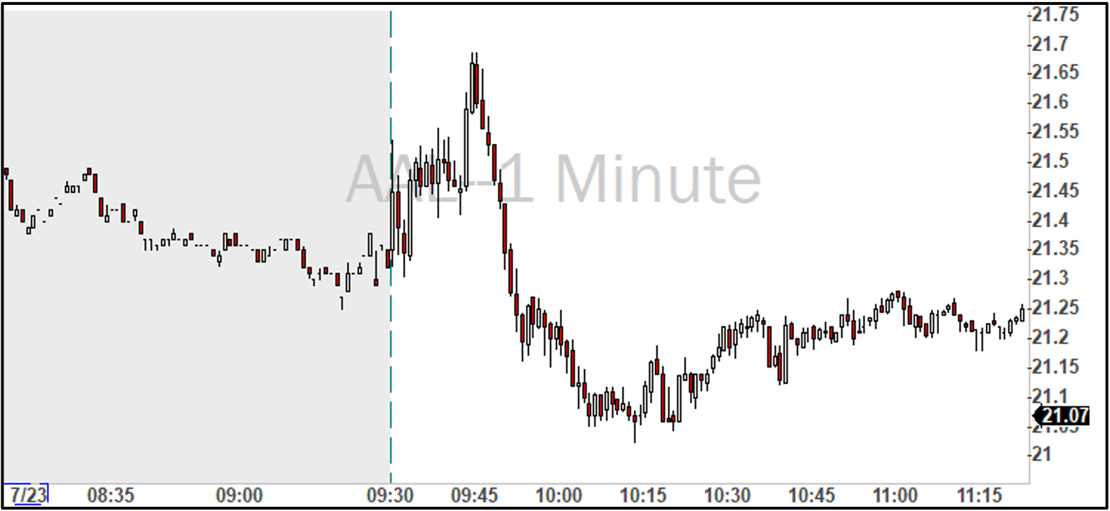
Figure 6.11 – Candlestick chart for American Airlines (AAL).
On this day, AAL shot up before reversing down to a new low of the day around $21.20, where it stalled out for a while before eventually continuing downward. The price recovered slightly and leveled off around $21.20-$21.25.
Now take a look at Figure 6.12 with the previous day’s closing price drawn as dotted line, which can be a very powerful support/resistance level:
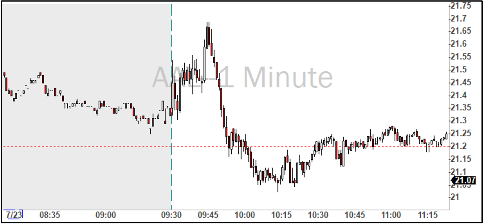
Figure 6.12 – Candlestick chart for AAL with previous day close indicator drawn.
This figure is an excellent example of the power of these levels and mass psychology in action. We can see that when the price began to tank at 9:45, it was on a highway to hell until it reached the PDC level. Some traders thought the price would rebound from that level, so there was a lot of buying activity there. Unfortunately for them, there was not enough demand to prevent the downward trend, which soon continued (reverse ABCD pattern). PDC appeared again later in the morning, as the first price it settled around after the rebound. It’s no accident that PDC and other levels have so much activity surrounding them.
Again, personally, I do not mark these levels on my charts to keep trading as simple as possible. However, if I were struggling with win rate, I would consider adding support/resistance levels to my charts before other indicators like SMA, RSI, MACD, etc.
Opening Range Breakouts (ORBs)
Now that you are familiar with candlestick charts and indicators, let’s look at the specific setups traders look for in these charts to find trades.
When the COVID-19 pandemic hit, travel stocks went nuts, and it was the most glorious time in the history of day trading. Shares of rental car companies, hotels, cruise lines, and airlines traded with very heavy volume and volatility, giving traders the time of their lives. It was like Christmas every day for months. CCL (Carnival Cruise Lines) was one such symbol, hitting day traders’ watchlists almost every day of 2020 and 2021.
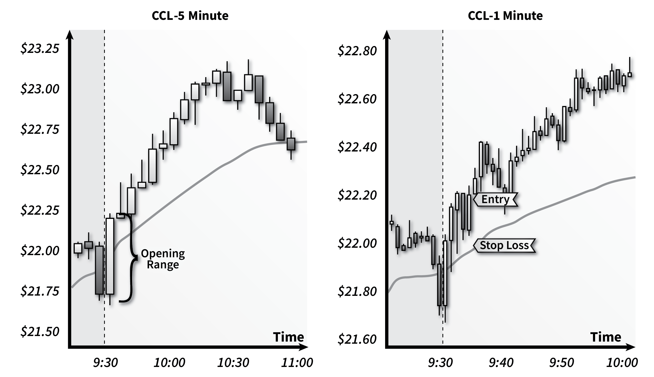
Figure 6.13 – Opening Range Breakout (ORB) setup on CCL.
Figure 6.13 is a good example of an opening range breakout (ORB) that occurred in CCL during the pandemic. The main goal of ORBs is to profit from the release of pressure at market open on overnight gappers. Because there is very little trading outside normal market hours, a lot of pent-up demand builds up during the other 17.5 hours of the day.
However, it is not always one-sided. If a stock gaps significantly overnight, there will be buyers ready to ride the wave, and there will also be bag holders that want to cash out after the move. “Opening range” refers to the wild price swings that occur while the two sides of the market battle it out. When one side wins, the price will then “break out” of the range.
I prefer to wait at least 5 minutes for the bouncing around to stop. For me, I find it difficult to distinguish between more bouncing and a true breakout earlier than this. Some traders wait up to 15 minutes, while others wait only 1 minute. The opening range can be of any duration, and you do not have to always wait the same amount of time.
When entering an ORB trade, I always look for a small price pullback to get a good entry price. Using the CCL example above, we can see that the sixth and seventh 1-minute candles show a little pullback. There is a bit of a wick on the sixth candle, so I probably would have entered at the close of the sixth candle. When watching that price action live, it likely opened at the candle’s low, moved to the high, then dropped a bit to the close. That’s probably where I would have entered – around $22.25.
The stop loss should be the price at which the candle intercepts VWAP, which is $22.00 in this case. Therefore, the stop loss distance is $0.30. If you are trading with 1/2 R/R ratio, then the profit target would be $0.60 from entry, or a price of $22.85.
Looking at both the 1-minute and 5-minute charts for CCL in the figure, it’s clear that the profit target would have been reached before the stop loss for a winning trade.
Although this example was for a long position ORB trade, it is equally valid for short trades.
In summary, my ORB playbook looks like:
- Wait at least 5 minutes after market open before entering an ORB.
- VWAP should pass through (roughly) the middle of the opening range.
- The low of the prior 1-minute candle (before entering the trade) should be near VWAP.
- Time & Sales should be showing many transactions on the bid for a short position or on the ask for a long position.
- Wait for either a large ask (long position) or a large bid (short position) before entering a trade.
- Large volume can be used as a substitute for a large bid or ask to indicate momentum in the preferred direction.
- Enter when a large bid/ask occurs, or volume begins to increase.
- If neither large bids/asks nor volume occurs, do not take the trade.
- Set stop loss to slightly below VWAP.
- Exit is determined by the R/R ratio and stop loss distance from entry.
ABCD Pattern
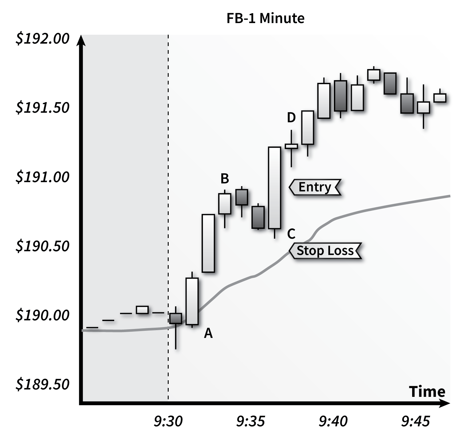
Figure 6.14 – ABCD pattern setup on FB.
The chart for Facebook (FB) in Figure 6.14 is a perfect ABCD pattern. Points “A” and “B” encompass a strong trend upward. The path from “B” to “C” is what we call a “pullback,” a temporary loss of steam. During all strong moves, there are always pull-backs – some bigger than others. Within the range of each candle are smaller pull-backs, and what you see between “B” and “C” is a bigger pull-back. This occurs during a sell-off from traders cashing in their profits if they were lucky enough to ride the stock from “A” to “B.” The bigger the move from “A” to “B,” the bigger the sell-off can be.
Eventually, everyone interested in selling does so, the momentum picks back up, and the stock continues to price “B” and higher (point “D”). The perfect entry is when the price returns to the “B” level after bottoming out at “C”. “D” or higher is where you’ll exit, depending on the R/R ratio you’re trading with.
A stock that pulls back to VWAP, such as in Figure 6.14, is my favorite ABCD trade. You can see in Figure 6.14 that with an R/R ratio of 1/2, you would win the trade in just two minutes. If we extended the time axis further to the right, we might see more candles going even higher, supporting an even better R/R ratio like 1/4 or 1/5.
In summary, my ABCD playbook looks like:
- Enter after “C” when price returns to “B” level.
- Set the stop loss slightly below “C”, ideally at, or slightly below, VWAP (above VWAP if taking a short position).
- Exit is determined by the R/R ratio and stop loss distance from entry.
Reversals
Figure 6.15 shows SPCE (Virgin Galactic) on June 30, 2016, with a perfect reversal opportunity about an hour after the market open. After initially climbing from $44.25 to almost $46.25, it began to sell off, approaching $43.00. A little after 10:30, an indecision candle appeared, which is often a great time to consider a reversal.
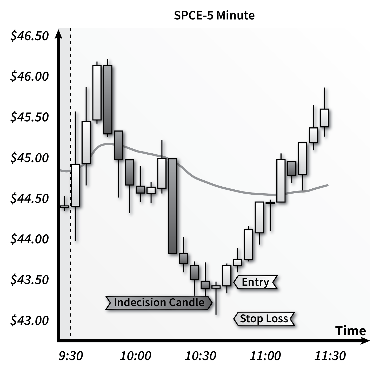
Figure 6.15 – Reversal on SPCE.
The indecision candle has a long lower wick, indicating that the bears tried to push the price down to $43.00 but couldn’t quite pull it off. The close of the candle is almost identical to the open, thus forming a doji / indecision candle. When the candle closes, the bulls are in control. The next 5-minute candle closed significantly higher than the previous one, further indicating a reversal is in progress. One thing you want to see is higher highs and higher lows, which is evident throughout the entire return trip back up to $46.00 in this chart.
A good entry would be at the close of the next candle after the doji. The safest stop loss is below the doji candle’s low.
In summary, my reversal playbook looks like:
- Look for a doji candle signaling indecision.
- Look for exhausting volume during the doji candle’s period, signaling the original trend is ending.
- Enter on the next candle after a doji with a higher high and a higher low (“lower high and lower low” for a short position).
- Set the stop loss below the doji’s low.
- Exit is determined by the R/R ratio and stop loss distance from entry.
Volume
I don’t want to overwhelm new traders with too many things to think about during their trading, but volume is one last item that is too important to ignore. In addition to watching the candlestick charts, Level 2, and Time & Sales, volume is another important piece of data to inform you when it may be a good time to enter a trade.
Figure 6.16 shows a window in DAS Trader with two charts: candlesticks for price (top) and bars for volume (bottom).
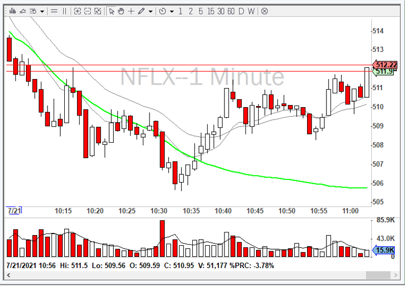
Figure 6.16. DAS Trader window showing candlestick chart for price and bar chart for volume.
“A Complete Guide to Volume Price Analysis” by Anna Coulling is a great resource for learning about volume and how to improve your entries using it (i.e., ultimately improving your win rate). I encourage all new traders to read it.
Bottom line, volume can act as a verification of the strategy you want to use. For example, if you want to take an ORB-up but there is no significant buying volume at that time, it may not be a good time to enter the trade. To paraphrase Anna, “real moves happen with volume.” I would encourage you to keep an eye on volume and re-evaluate your entry if you do not see increasing volume in your favor.